This tutorial provides detailed instructions on how to use the PathVar interface to analyze
gene expression variance in cellular pathways using microarray data.
1. Introduction and feature overview
Finding significant differences between the expression levels of genes or proteins across different biological conditions is a primary goal
in the analysis of high-throughput transcriptomics or proteomics data. Typical approaches for this purpose use statistical tests
which account for the differences between mean or median expression levels across different sample groups, as well as for the within-group
variance across samples and potential outliers. In recent years, the analysis of more robust expression patterns across entire gene or protein
sets
using gene set enrichment analysis (GSEA) methods has become a widely accepted approach
to detect deregulations of entire pathways and process reflecting changes in biological conditions.
However, regardless of whether single genes/proteins or sets of aggregated gene or protein expression levels are examined, the search for significant
differences between averaged expression values across groups of samples is not necessarily the most promising approach to find
discriminative rules to differentiate between different biological conditions and gain new biological insights.
In particular, when comparing samples representing an abnormal/disease state against normal/healthy control samples, in many cases
the abnormal state is not characterized by a joint up- or down-regulation of functionally related genes/proteins (which can be detected using
statistics based on the differences in mean/median expression value), but by a change in the variance across their expression values.
The difference between
differential expression (using averages) and
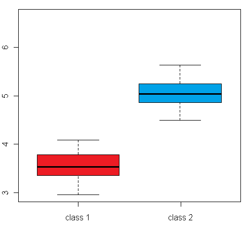
differential expression variance is highlighted in the plots in figure 1:
The left box plot shows a synthetic example for a differentially expressed gene/protein (or aggregated expression values representing a gene/protein set), with different mean expression levels across two biological conditions A and B, whereas the right box plot shows an example with no difference in the mean expression level, but a large difference between the within-group variance
(depending on the whether a single gene or a gene set is examined, this can be a variance across different samples, or a variance across genes/proteins from a set of functionally related genes/proteins):
 |
 |
Figure 1: Comparison of an example box plot for a differentially expressed gene/protein (left) with a box plot for a gene/protein with similar mean expression levels across the sample classes but differential variance (please note that the vertical axis could represent both a single gene/protein or summarized expression values for a set of genes/proteins after dimensionality reduction)
While most statistical approaches for feature selection and sample classification of gene and protein expression data would
only consider the example in the left plot as a useful feature to discriminate between the sample classes, the difference in the variance
across sample classe in the right plot might also contain significant discriminatory information and provide new biological insights.
For example, in a cancer disease the expression levels for genes in a certain cellular pathway might be significantly deregulated, but
not in terms of a joint up- or down-regulation, but in terms of a higher variance across the genes in the pathway.
Moreover, since gene or protein sets representing cellular pathways, processes or complexes in databases like KEGG, BioCarta, Gene Ontology etc. mostly contain several genes or proteins (we consider datasets with a minimum size of 10), the comparison of the variance across these genes in all samples can provide a robust measure of differences observed across the sample classes.
For this reason,
PathVar was introduced to provide easy access to a pathway expresson variance based analysis of microarray data.
PathVar uses
gene and protein set definitions representing cellular pathways, processes, complexes or shared functions from the databases KEGG, BioCarta, WikiPathways, Reactome, NCI Pathway Interaction DB, Gene Ontology and InterPro to extract corresponding gene/protein expression vectors from a microarray dataset to find patterns of differential variance across different biological conditions.
In comparison to other microarray analysis tools,
PathVar provides the the following new features:
- The data is analysed on the level of pathways, processes and complexes to attain a higher robustness and confidence
in comparison to a classical analysis at the single-gene level.
- The software detects differential variance patterns, which are particularly common in datasets comparing cancer
and genetic disease states against healthy control samples.
- New insights for the biological interpretation of microarray data are not only gained by the identification of differential
expression variance patterns, but also by using these patterns to identify similarities between samples (Clustering module) and to classify samples
into different biologically meaningful categories (Prediction module).
Details of these features and the corresponding three analysis modules (Selection Module, Clustering Module and Prediction Module) are explained below.
2. Quickstart guide
To get a quick impression of how to use
PathVar and what kind of results you can expect, you can choose one of the example datasets
on the main user interface (top right of the page, see Figure 2 below), select a database of gene set definitions and simply
click the "Submit" button at the bottom of the page.
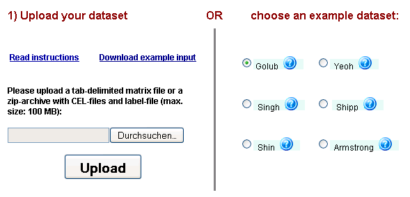
Figure 2: PathVar dataset selection & upload interface - users can choose one of the 6 example datasets on the right
by a single mouse-click or use the upload interface on the left to provide their own data.
While the submitted job is being processed, you can either provide your e-mail address to be notified, when the job is complete, or bookmark
the results notification page to return at a later time. As soon as the job has been processed, you will be automatically redirected to the first
results page. On this page, there are four different options to analyse the pathway variance patterns extracted from the datasets - you can:
- inspect the ranking table of gene/protein sets with differential variance across the sample classes (on the same page, top)
- view a heat map visualization of the gene/protein sets with differential expression variance (on the same page, bottom)
- compute a sample clustering using the extracted differential expression variance (on a new page, requires an extra processing step)
- apply a supervised classification analysis using the extracted differential expression variance (on a new page, requires an extra processing step)
Each of these four options will be explained in detail in the sections 4. to 7. below - however, you can also simply try out the different options
on the example datasets and use the help boxes (

) on the corresponding result pages, if you need explanations for one of the visual or tabular outputs of the different algorithms.
3. Uploading your own data
In order to analyze a custom microarray gene/protein expression dataset with
PathVar, the user has two options to upload the data:
Option 1: You can upload a tab- or space-delimited text-file containing pre-normalized microarray data in the following simple matrix-format (see Figure 3):
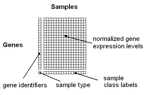
Figure 3: Format for uploading a gene/protein expression matrix
You can download an example data file
here (use right-click and "Save as"). The columns must correspond to the samples and the rows to the genes. The first column contains the gene identifiers (a unique label per gene) and the last row the class information for the samples (multiple samples can have the same class label). The rest of the matrix should contain normalized expression values obtained using any of the common microarray normalization methods (e.g. VSN, RMA, GCRMA, MAS, dChip, etc.). The
gene identifiers can be any one of the following: Affymetrix ID, ENTREZ ID, GENBANK ID. You can also use your own identifiers; however, in this case, you will not obtain any links to functional annotation data bases. The
class labels can be any alphanumeric strings or symbols (e.g. "tumour" and "healthy", or "1","2", "3", or "leukemia1", "leukemia2", "leukemia3", etc.). Samples belonging to the same class need to have identical class labels. The last row containing the class labels has to begin with a user-defined "sample type"-label, e.g. "phenotypes", "tumours" or just "labels". Optionally, unique IDs per sample can be specified in the first row (if this line is missing, the samples will be numbered consecutively).
Option 2: You can upload a compressed ZIP-archive containing Affymetrix CEL-files and a text-file containing tab-delimited numerical sample labels (specifying replicates by the same number, i.e. "1 1 1 2 2 2" for an experiment with 6 samples, two classes and three samples for both class 1 and class 2)
Please
contact us, should you experience any kind of problems when uploading or analyzing your data.
4. Identification of gene/protein sets with differential expression variance
After uploading a microarray dataset or choosing one of the example datasets, the user can choose to analyze the data using one of 7 different
gene set databases representing pathways and processes, sequence-based functions and cellular localizations: The
Kyoto Encyclopedia of Genes and Genomes (KEGG),
BioCarta,
WikiPathways,
Reactome,
NCI Pathway Interaction DB,
InterPro and
Gene Ontology.
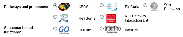
Figure 4: The database selection menu
By clicking the button "Submit" button below the selection menu, the data will be uploaded and processed, to extract the expression values of the gene sets
corresponding to pathways, processes, complexes, etc. and to compute the variance across these expression values within user-defined
samples classes (e.g. "tumor" vs. "normal", "disease subtype 1" vs. "disease subtype 2" vs. "disease subtype 3", etc.). In the meantime,
the user is re-directed to an automatically updating web-page that can be bookmarked to see the results of the analysis at a later time.
Alternatively, an e-mail address can be provided to receive a notification message when the analysis is complete.
On the final results page, the user will see a menu (see Figure 5), containing 6 different options to inspect the results and apply further analyses:
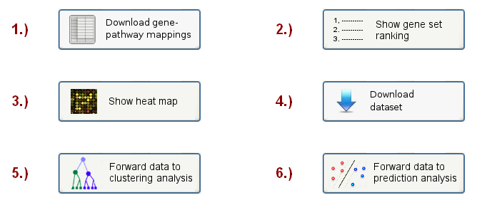
Figure 5: Analysis choice menu
Here only the first four options will be discussed (the clustering analysis is discussed in section 4, the prediction analysis
in section 5).
The first button allows the user to download a mapping table, showing how the genes/proteins in the input data set
have been mapped onto the pathways in the chosen database. The mapping table is provided in a tab-delimited text-file
format, where the rows correspond to the genes and the columns to the pathways (the first columns contain the gene names in different
identifier formats and the first row contains the pathway identifiers). This matrix can easily be copied into common spreadsheet programs and parsed into a tabular format, e.g. in recent Excel
versions the "Text to columns..." command in the "Data" menu will create a table from the data, after pasting it into an Excel sheet.
When clicking on the second button, the webpage scrolls to a sortable gene set ranking table (see example in Figure 6), which lists
the identified gene sets with the most significant differences between the differential expression variances across the pre-defined sample classes
(i.e. the biological).
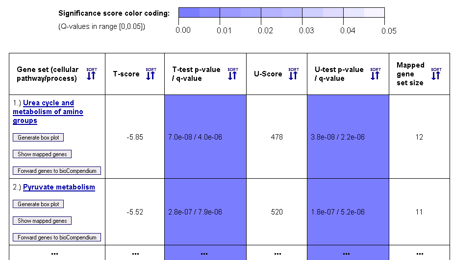
Figure 5: Gene set ranking in terms of differential expression variance (example table for gene sets from the KEGG database)
This gene set ranking table enables the user to obtain a quick overview on how the variance in the expression levels of genes within a cellular pathway, process or complex differs across the biological conditions of the samples (given by the sample class labels). Both a parametric T-test (T-score in column 2) and a non-parametric Mann-Whitney U-test (U-score in column 4) are computed to score the differential expression variance across the sample classes. For multiclass data, an F-test for equality of means (not assuming equal variances) and a non-parametric Kruskal-Wallis test are performed. The statistical significance of these scores is estimated using p-values, which are adjusted to account for multiple testing using the Benjamini-Hochberg method (columns 3 and 5).
Above the table, a color coding legend for the significance scores is shown, which is used to highlight statistically significant probability scores (p-values) in a range between 0 and 0.05 by coloring corresponding table cells in different shades of blue.
Since the gene sets can have different sizes, depending on the number of genes/proteins in the corresponding pathway or complex and the number of genetic probes from the microarray that could be mapped onto the pathway/complex, the final 6th column reports the mapped gene set size. The names of the pathways, processes and complexes that are represented by the gene sets are given in the first column, which also contains links to the corresponding entries in pathway databases (KEGG, BioCarta, etc.) and to forward the genes to the
bioCompendium web-application for further analysis (button:

). Moreover, the user can view the mapped genes (button:

) and generate a box plot visualization of the differential variance of expression levels in a chosen gene set (button:
) for each entry in the first column of the table (if your browser blocks the automatic opening of a new browser window, a link to the box plot will appear at the top of the results page).
An example box plot, revealing a differential variance pattern in the genes of the KEGG Pyruvate metabolism pathway across the sample classes of the prostate cancer dataset by Singh et al. (2002), is shown in Figure 6.
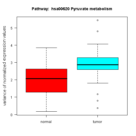
Figure 6: Box plot for a gene set with differential expression variance between the tumour and normal class in the prostate cancer dataset by Singh et al. (2002)
When scrolling to the bottom of the first results page, or clicking the "Show heat map button" button at the top, a heat map visualization will be shown,
that provides the user with an overview of the expression level variance across the genes in the gene sets from the chosen pathway databse, and enables a comparison of this gene set variance across the different samples in the dataset, using colors to represent different value ranges (see example visualization for the prostate cancer dataset by Singh et al. in Figure 7). The rows in the heat map stand for the different gene sets, and the columns for the samples/arrays. Both the rows and samples are clustered using average linkage hierarchical clustering to highlight groups of similar samples and respectively, groups of gene sets with similar expression profile. Importantly, the heat map only visualizes the gene sets with significant differential variance across the sample classes (see blue coloured genes in the ranking table in section 1), hence, if there are no gene sets that fulfill the significance criterion (q-value significance score < 0.05), no heat map will be generated.
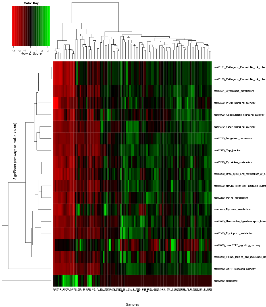
Figure 7: Heat map to visualize the expression variance across all gene sets selected as signifance (the blue entries in the table above)
Finally, the user can also download the matrix of pathway expression variances, in which the columns correspond to the samples and the rows to different pathways, by clicking on the "Download dataset" button.
The next two sections will discuss how this data can be analysed on the web-interfaces for sample clustering and classification.
5. Sample clustering using differential expression variance
By clicking on the "forward data to clustering analysis" button on the first results page (see Figure 5 above), the user will be re-directed to
a new page to configure and run a sample clustering analysis using the previously extracted pathway expression variance data.
This type of analysis enables the identification of groups of samples with similar expression variance patterns across the gene sets and can be particularly useful in cases when no categorization of the samples into different biological conditions is available
a priori.
The user can choose between 3 partition-based (k-Means, Partitioning Around Mediods (PAM), Self-Organizing Maps (SOM)), 4 hierarchical clustering algorithms (Average linkage hierarchical clustering (HCL), Self-Organizing Tree Algorithm (SOTA), Divisiv Analysis Clustering (DIANA), Hybrid Hierarchical Clustering (HYBRID)) and one ensemble method (ALL) to cluster the data (see the selection menu in Figure 7).
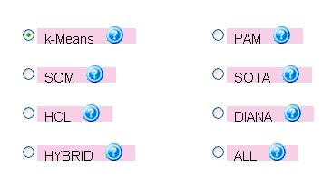
Figure 7: Clustering method selection menu, providing access to 7 different clustering methods and an ensemble approach (ALL)
combining multiple algorithms together
Moreover, before applying the clustering methods, the data can be standardized using either a classical transformation to mean 0 and standard deviation 1 ("Classical" approach) or by subtracting the median and dividing by the median absolution deviation, which provides more robust results with regard to outliers ("Robust" approach).
Finally, before submitting the analysis task (or alternatively later, while the job is running), the user can provide an e-mail address to be notified
when the clustering results are ready.
On the results page, the different sections in the output will partly depend on the clustering method that was chosen by the user. For example,
a dendrogram plot will only be generated for a hierarchical clustering method. However, in general, the output consists of the four sections
"Evaluation statistics" (for the validation of the clustering results using cluster validity indices), "2D visualization of clustering results" (containing visualizations of the validity index values across different numbers of chosen clusters, a principal component analysis (PCA) plot of the clustering results and optionally, a dendrogram),
"3D visualization of clustering results" (containing 3D plots generated using PCA, Independent Component Analysis (ICA) and other dimensionality reduction methods) and a "Download" section to obtain a file with the cluster assignments for each sample (see the selection menu in Figure 8).
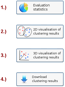
Figure 8: Clustering results sections and selection menu
The evaluation statistics mainly consist of ranking tables for different clustering results obtained with the chosen algorithm across different
parameter settings for the number of clusters. More specifically, the algorithm computes the clustering results for cluster numbers ranging from 2 to 8
and determines five validity indices to assess the utility of each clustering result in terms of the compactness of the obtained clusters and the separation between them. These validity scores include the
Calinski-Harabasz index, the
Silhouette Width, the
Dunn index, the
C-index and the
kNN-Connectivity.
Since microarray data can contain several biologically meaningful cluster structures, these validity indices can help to identify more informative clusterings and good choices for the number of clusters. The first table shows the ranking scores (from 1 = best to 7 = worst) for each combination of a clustering algorithm and a validity index, providing a quick overview on which number of clusters was considered to provide a good separation by which method (see example in Figure 9).
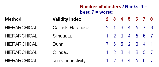
Figure 9: Ranking table for different numbers of clusters scored in terms of five cluster validity indices
The second table below summarizes these results, by showing only the best number of clusters for each method combination and the corresponding validity score (see Figure 10).
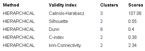
Figure 10: Ranking table for different numbers of clusters (showing only the scores for the best numbers of clusters in terms of different validity indices)
Finally, the results are aggregated into three final ranking scores, estimating the optimal number of clusters as (1) the majority vote solution across all method combinations, (2) the median number of clusters across the best results of all method combinations, (3) the solution that received the best sum of ranks across all method combinations and numbers of clusters (see Figure 11). The majority vote clustering solution obtained from these aggregated scores is used in the subsequent analysis steps discussed below.
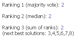
Figure 11: Final results for the selection of the optimal number of clusters using different ranking methods combining the information from multiple validity indices
To facilitate the interpretation of the evaluation results, the second section of the clustering results page contains 2D visual representations
of the results. These include plots of the cluster validity scores for different clustering results (see above) and different properties of the specific clustering result that received the best overall validity scores. In the visualization of the validity indices, the scores have been transformed and re-scaled, such that the best score is 1 and the worst score is 0 (vertical axis in the plot), and these transformed scores are plotted against the number of clusters (horizontal axis, see Figure 12).
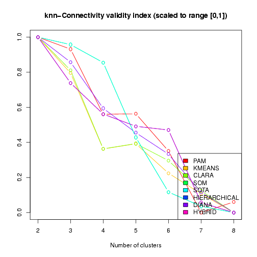
Figure 12: Visualization of the kNN-Connectivity validity index across different clustering results (scaled and transformed to best score = 1, worst score = 0)
The next plot shows a 2D representation of the optimal clustering results (in terms of the validity indices) using a dimension reduction to the space of the two principal components (the clusters are highlighted by ellipses, Figure 13).
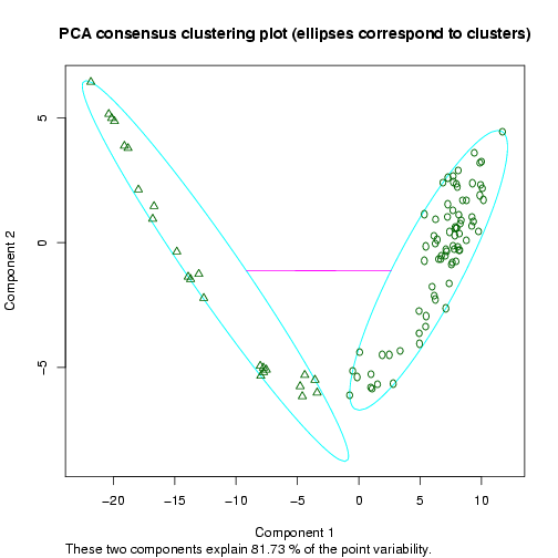
Figure 13: Example 2D Principal Component Analysis plot for the dataset by Singh et al. (2002), showing the cluster separation for a clustering into two sample groups
Moreover, to obtain a visual impression of the reliability of the cluster assignment for every single sample, a Silhouette plot is shown, in which the length of horizontal bars reflects the confidence in the cluster assignment of a sample (given by its Silhouette width, and sorted by decreasing score from top to bottom, see Figure 14).
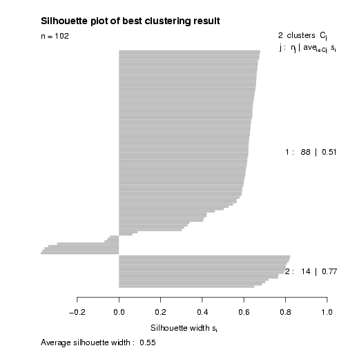
Figure 14: Silhouette plot visualizing the cluster assignment confidence by the length of horizontal bars
Finally, if the user has selected a hierarchical clustering method, a corresponding cluster dendrogram (i.e. a tree visualization) is shown in a separate plot (see example for the dataset by Singh et al. (2002) in Figure 15).
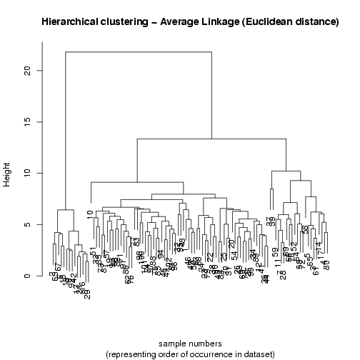
Figure 14: Average linkage agglomerative hierarchical clustering dendrogram constructed for the prostate cancer dataset by Singh et al. (2002) using the Euclidean distance as distance measure
Below the 2D visualization results, the user can also inspect interactive 3D visualizations of the clustered data, created using dimensionality
reduction methods like Principal Component Analysis (PCA), Independent Component Analysis (ICA) and IsoMap (see example 3D PCA visualization in Figure 15).
When moving the mouse over one of the datapoints in a Java-enabled VRML viewer or browser plugin, the corresponding sample number will be
highlighted in the plot.
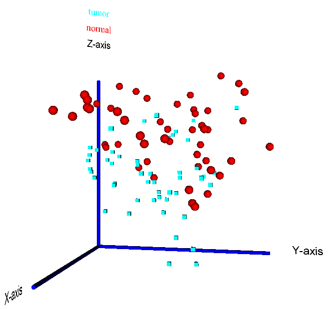
Figure 15: 3D visualization of a PCA reduction of the prostate cancer dataset by Singh et al. (2002) - the two sample classes "tumour" vs. "normal" are highlighted by different colors (red = normal, blue = tumour) and data point symbols (sphere = normal, cube = tumour)
Finally, in addition to all tabular and visual representations of the results, the user can also download the final cluster assignments computed by the Cluster Analysis module. In particular, when using selecting the "ALL" method, the user can download the clustering results for all 7 clustering algorithms (3 partition-based and 4 hierarchical clustering methods, see above), and will additionally be provided with a consensus clustering result, computed by optimising the agreement between all clustering solutions and a tentative consensus clustering vector using Simulated Annealing.
In summary, the Clustering Analysis module provides several possibilities to identify both hierarchical and non-hierarchical cluster structures in pathway expression variance data, to identify biological meaningful groupings among the samples. The analysis of the data is facilitated by tabular overviews
of the cluster validity indices and 2D and 3D visualizations of the clustering results.
6. Sample classification using differential expression variance
As an alternative to the clustering analysis of pathway expression variance data,
PathVar can also build supervised machine learning models
to classify samples into pre-defined biological cateogiries, if labelled training data for the model generation is provided by the user.
If the user clicks on the "Forward data to prediction analysis" button, on the first results page (see Figure 5 above), a new webpage is loaded
to configure a supervised analysis of the data.
As a first option on the top of this page, to select the most informative gene/protein sets for the generation of predictive models, the user can choose between five feature selection
methods (
empirical Bayes moderated t-statistic (eBayes),
Significance Analysis of Microarray Data (SAM),
Partial Least Squares based feature selection (PLS-CV),
Random Forest based feature selection (RF-MDS) or
Correlation-based feature selection (CFS)) or an ensemble approaching using the sum of ranks of the individual selection methods (ENSEMBLE). Alternatively, the user can also apply the machine learning methods without feature selection (method
NONE); however, this will result in longer runtimes and more complex models (see Figure 16, showing the
selection menu for the feature selection algorithm).
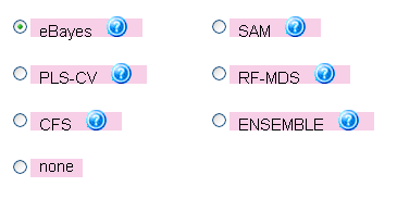
Figure 16: Menu for choosing the feature selection algorithm
More important than the choice of the feature selection method is the choice of the machine learning algorithm to build a predictive model
form labelled training data. For this purpose, a second menu enables the user to select and compare diverse types of classification algorithms
including a linear
Support Vector Machine (SVM), the
Nearest Shrunken Centroids methods (also known as Prediction Analysis for Microarrays, PAM), a
Random Forest classifier (RF), the
k-Nearest Neighbors classifier (kNN) and an
ensemble approach combining the output from multiple classifiers into a majority-vote prediction (ENSEMBLE, see Figure 17, showing the prediction method selection menu).
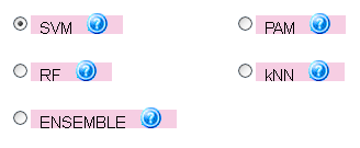
Figure 17: Menu for choosing the classification algorithm
After choosing the desired feature selection/classification method combination, the user only needs to decide on an evaluation scheme to estimate
the accuracy of the generated classification model, using either an
n-fold cross-validation (where the parameter
n is chosen by the user),
or a self-defined training/test set partition. For the last option, the self-defined sample partition can either be obtained by specifying the indices of training set samples using comma-separated sample numbers (starting from 1 for the first sample occurring in the input data set), or choosing a percentage of randomly selected training set samples by selecting the "user-defined training/test set partition" option (the user should note that class labels for all input samples need to be provided with the uploaded dataset, but if the class for a sample is unknown, the user can simply provide a randomly chosen dummy label).
After clicking the submit button (and optionally entering an e-mail address to receive a notification message when the prediction results have been computed), the job is processed in the background and the user will be redirected to a new webpage, as soon as alll classification results are ready.
Although the specific content of the results page depends on the chosen evaluation method, it is generally structure into 3 sections: The evaluation statistics, the ranking of gene sets (here in terms of their predictive value across different cross-validation cycles and not in terms of the extent
and statistical significance of differential expression) and a heat map visualization of the expression value variance in the top-ranked gene sets across all samples (see the classification results menu in Figure 18).
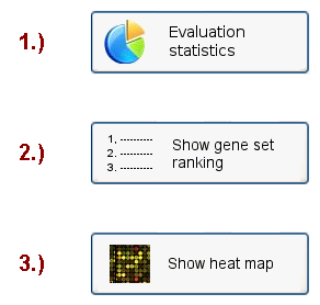
Figure 18: Classification results menu
The first results section contains classical evaluation statistics for classification algorithms, including the average prediction accuracy (and
its standard deviation across the cross-validation cycles), the sensitivity and specificity, Cohen's Kappa statistic, upper and lower 95%-confidence intervals for both the accuracy and Cohen's Kappa, the number of true positives, false positives, true negatives and false negatives (for binary classification problems), and a classification p-value computed according from the proportional chance criterion (C. J. Huberty, 1994).
Example evaluation statistics for a 10-fold cross-validation analysis of the prostate cancer dataset by Singh et al. (2002) are shown in Figure
19 (in this case the eBayes feature selection was combined with the ensemble classification approach).
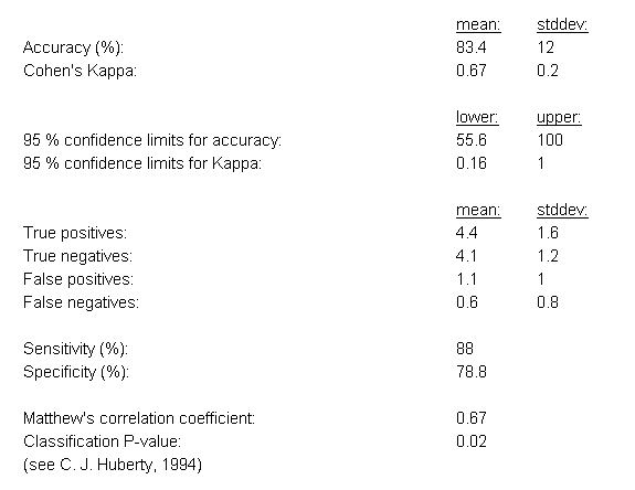
Figure 19: Evaluation statistics for the classification results
If n-fold cross-validation is used as the evaluation scheme, a ranking of gene sets will also be computed,
using the frequency of selection for each gene set across the cross-validation cycles to derive a Z-score estimate
of the gene set's utility for sample classification (see the top entries of an example ranking table in Figure 20).
Moreover, the Z-scores are plotted in decreasing order to obtain a quick estimate of the number of features
for which the Z-scores start to decline below zero (see Figure 21). This information can be useful to estimate
the maximum number of features to be selected for the next predictive model to be generated, to avoid
including uninformative features (over-fitting) and excluding informative features (under-fitting).
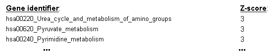
Figure 20: Z-score ranking of gene sets derived from their frequency of selection as predictive features across the cycles of the cross-validation
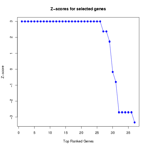
Figure 21: Plot of Z-scores for frequently selected features
Finally, similar to the first results page for identifying gene sets with differential variance, a heat map is generated to visualize the
expression variance for the gene sets that were chosen as most predictive on the classification module. Again, the columns in this plot
represent the samples and the rows represent the features (gene sets), and both rows and columns are clustered to highlight patterns of
samples or gene sets with similar expression variance across the features, or respectively, the samples (see Figure 22).
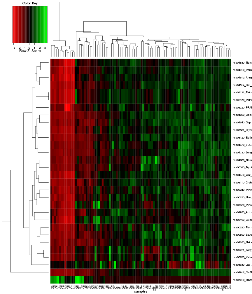
Figure 22: Heat map of frequently selected gene sets with differential expression variance
If the user has chosen a self-defined training/test set partition instead of a cross-validation scheme for evaluation, the prediction results
for the test set will also be made available as a downloadable text file at the bottom of the results page.
In summary, the prediction analysis provides a wide range of possible combinations between feature selection and prediction methods
to learn predictive models from the pathway expression variances extracted from a microarray dataset. The evaluation of the classification results
includes both classical performance statistics and (for the cross-validation scheme) a ranking method to prioritize gene sets in terms of
their utility as predictors for sample classification.
The analysis does not only provide experimenters with a new means to generate robust gene set based classification models with high accuracy, but the models enable a novel interpretation of the data, on the level of pathways and processes and in terms of differential variance as opposed to the
classical focus on differences in mean expression levels.
Thus,
PathVar enables the extraction of new insights from previously analyzed datasets and provides an opportunity for
creating more robust and potentially more accurate prediction models by exploiting an alternative approach for the extraction of
biologically meaningful patterns in microarray datasets.
7. Statistical limitations and user advice
When using
PathVar, statistical limitations can arise from
lack of information, e.g. due to
incomplete mappings of genes/proteins onto pathways
or small numbers of samples in the input data,
and/or from a large number of considered pathways.
The
associated statistical issues are commonly referred to as the "curse of dimensionality"
and the "multiple testing problem" in the literature.
To assist the user in avoiding false conclusions due to these limitations,
PathVar only considers pathways with a minimum of 10 mapped gene/protein identifiers
in all analyses and adjusts the p-value significance scores for multiple testing
according to Benjamini and Hochberg.
Moreover, the user has different possibilities to
inspect how the genes/proteins in the input dataset were mapped onto the
chosen pathway or process database. The mapping results can either
be downloaded in a tab-delimited matrix format (first button on the top
of the results page) or accessed separately for each pathway by clicking on the
``Show mapped genes'' button in the first column of the pathway ranking table
(section 1 on the results page).
Since
PathVar
is not designed to take the hierarchical relationships between
gene sets in the Gene Ontology database into account,
a cut-down version of this database is used,
the generic
GOSlim.
However, different pathways in the provided databases might
still share a significant number of genes/proteins,
hence, if the user suspects a high significance score for a pathway to result from the
overlap with another top-ranked pathway,
the corresponding overlap can be checked using
the downloadable gene-pathway mapping table.
Although these measures can help to facilitate data interpretation and avoid false conclusions,
the user still needs interpret the results with caution, considering
both the statistical outputs (in particular the q-value, i.e. the p-value significance
score adjusted for multiple testing) and the gene/protein mapping results.
Moreover, the input data provided by the user has to fulfill the requirements specified
in the corresponding section of the online tutorial (section ``Uploading your own data'').
Specifically, in order to identify statistically significant differences across different biological conditions,
replicate samples are required for each studied condition.
The user has to make sure that the number of these replicate samples is sufficiently large,
depending on the desired sensitivity and on
whether a clustering or classification analysis is required in addition to the ranking of pathways.
8. Troubleshooting (system requirements & browser compatibility)
PathVar is compatible with any recent version of a Javascript-enabled web-browser on common 32-bit
operating systems (Windows, Linux and MacOS). The webpage is optimized for a screen resolution of 1280x1024.
To display the interactive 3D visualizations on the clustering results webpages, the user can either
install a VRML browser plugin (e.g. the freeware
Cortona 3D Viewer) or download the VRML visualization
and use an offline VRML viewer (e.g. free multiplatform software includes
ORBISNAP,
BS Contact,
Xj3D). Importantly,
the VRML viewer needs to support the VRML 2.0 format.
Should you experience other problems when displaying the web page or downloaded results (e.g. 3D VRML visualizations), please
contact us.